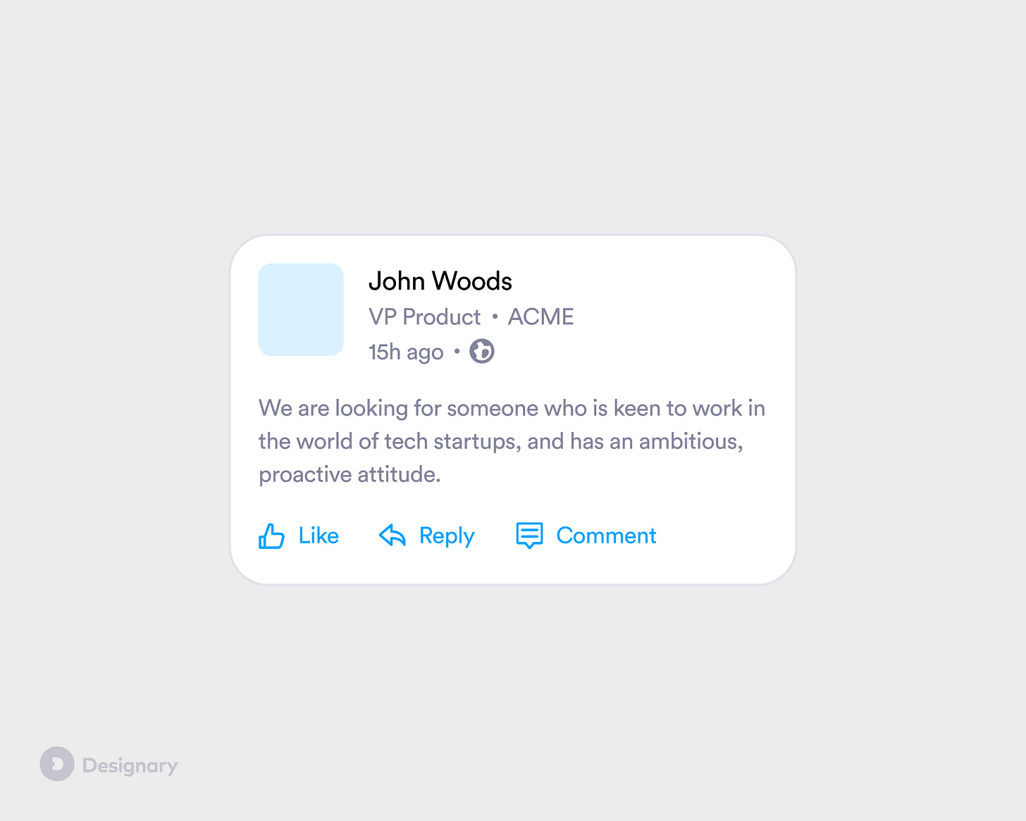
UX Tip #5: Interpunct — The unsung hero of content dense layouts
A tiny element that can come a long way in complex interfaces
Pro tip: In content dense layouts, try using interpuncts (dots) instead of separators or boxes.
In typical layouts, you might choose to separate UI elements by using whitespace, separators, boxes, cards or whole containers. However, these solutions can make a design feel very noisy, especially when there is a lot of information to display.
The interpunct is one of the most effective ways to add visual separation that is subtle, space-efficient and very flexible.
When to use it?
When you are trying to visually separate multiple text elements of the same importance.
When not to use it?
Don't use interpuncts when trying to separate non-text content, e.g. images, or for grouping elements that have different importance or context.
Also, just because you can display more content, that doesn't mean you have to. Always try eliminate the noise and use what's essential to your user at the right time. Instead of displaying additional content, could you add it in a separate state or screen?
How to make it even better?
Interpuncts work well when they use the same colour as the text elements they are separating.
Ensure there is adequate spacing before and after the interpunct. If, for example, you are using a 4px grid, 4-8px of spacing should be enough. Anything more than that and the elements you are trying to connect might actually feel more separate than intended.
Make sure they are aligned with your text. Depending on the implementation of an interpunct (via HTML or an image asset) some misalignment might occur, therefore make sure to check with your engineering partners so that it's balanced and neat.
What are some examples of products using this?
Facebook, LinkedIn, Reddit, Booking.com as well as a plethora of content-focused products.


