Basics: Grid systems and the 4px grid
Understand how grid systems work to establish vertical rhythm in your design
Pro tip: Use a 4px grid system in your designs to ensure visual consistency and rhythm.
What is it?
The baseline grid is one of the most essential layout structures in product design. It makes interfaces more consistent, balanced, and easier to scan by users, as it establishes a repetitive pattern in visual recognition for your users.
It also eliminates the guesswork out of designing layouts, which massively increases efficiency when designing digital products.
How to use it?
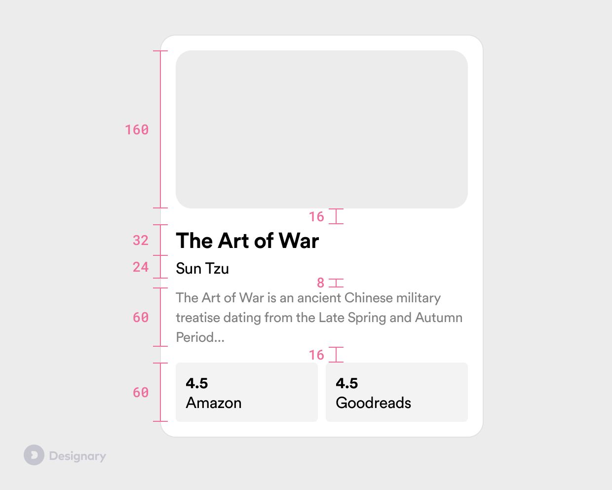
To establish a soft 4px grid, ensure all sizes, spacing (margins, padding) and line-heights in your designs are multiples of 4px. As simple as that.
Example spacing values: 4px, 8px, 12px, 16px, 24px, 32px.
Example line-heights can be 16px, 20px, 24px, 32px, 48px and so forth.
⌨️ Figma tip: The best way to use a baseline grid in Figma is to simply ensure you are using
AutoLayoutpredominantly, and ensuring the margin and padding values are always multiples of 4.
Soft vs. hard grid?
There are two popular methods of applying a baseline grid:
A hard grid calls for splitting every layout horizontally and vertically into increments, and carefully placing every element on that grid for visual consistency. It's a more rigid structure that works great in print, but can prove to be inefficient in digital product design.
A soft grid simply calls for elements to be positioned in relation to one another, as long as those spacing values are always increments of the baseline (4px.)
In modern UI/UX design, soft grids are the more popular approach due to how much faster and easier they are to implement. They are also much more similar to how layout works on the development side.
Why 4px?
Traditionally, 8px was used as the most popular baseline grid in product design. It has now been succeeded by the 4px grid in popularity, due to the flexibility that the lower baseline can provide.
The original 8px grid works wonders on desktop web, but when it comes to mobile screens or content-dense layouts, it can prove to be cumbersome as 8pt increments can often be too big to use between smaller elements.
Pixels (px) vs. points (pt)?
Points vs. pixels is a whole different topic that is worth covering separately. For the sake of simplicity and since modern product design is always done at 1x, assume that 1 point = 1 pixel, and the values can be used interchangeably.
What do I do with iPhone sizes (375px)?
The benefit of the soft grid is that you mostly need to care about spacing, and not absolute widths.
Keep using your predefined spacing values, and if an element needs to take up the whole screen width, resulting in an odd number, that's absolutely fine.


