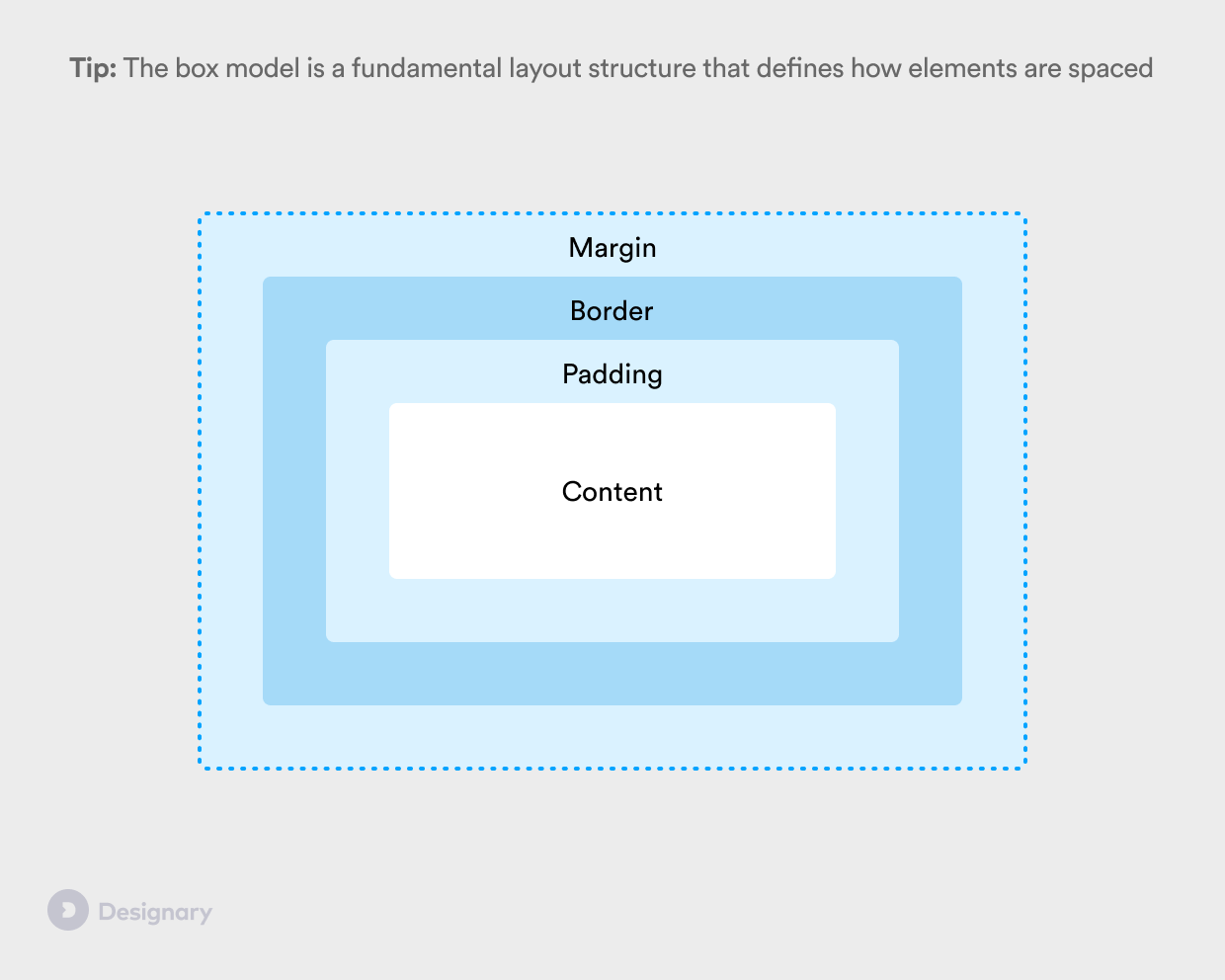
Basics: The box model
The box model is a fundamental concept in layout design and will help you better understand how paddings and margins work
Pro tip: Understand how the box model works so that you can speak a common layout language with developers.
What is the box model?
The layout, spacing and dimensions of all objects in UI design is defined using the box model. In the box model, every object on the screen is defined as a box.
Even though there are small differences between web browsers, native iOS and Android, the following definitions are fairly consistent:
Content - The content of the box: That's usually your text and image content.
Padding - A transparent area around the content. Padding is used to define the internal spacing of an element, and can be an excellent way to add more whitespace to your layout, improve legibility and maintain visual balance.
Border - A border that goes around the padding and content, but inside of the box's margin.
Margin - A spacing area outside the border of an element. Margins are traditionally used to define the spacing between different elements.
🧠 Development note: There are situations in which the spacing between objects isn't defined by their margins, but rather by using more adaptive, "stacked" collections of objects. Examples of that include Figma's AutoLayout, Flexbox in CSS, Stack Views in iOS and LinearLayout in Android. In all of these cases, a "stacked structure" is used to define a collection of objects, and rather than using margins, you simply define the spacing between objects.
Why should I care as a product designer?
Understanding how paddings, margins and borders work is fundamental knowledge that will help you both design better layouts, as well as communicate with your team's developers in a common language.
How do I use it?
You've probably already used the box model concept, but you didn't know what it was called! Every time you've used margins or paddings you are essentially using the box model structure to define spacing within your product layout.
The issue with borders in development
When designing in any modern software (Figma, Sketch, Adobe XD, Framer) you will notice that borders don't affect the layout of an element, as they don't add to its size.
Annoyingly enough, the same doesn't always apply with the box model. By default, borders are calculated into the size of an element, meaning that if you add a 1px border to a 40x40 element, the resulting size will be 42x42, and adjacent elements will be pushed further out. That's a no-go.
Having said that, in most modern front-end development languages, there are simple ways to overcome this.
⌨️ Development tip: To ensure a consistent border behavior between design and implementation, speak with your team's developers to try using an optimised implementation. For CSS, that would be
border-sizing: border-boxor thebox-shadowmethod.


