UX Tip #9: Sections, structure and visual hierarchy in UX
Using blocks, dividers, color, iconography and scale to effectively structure your layouts
Pro tip: Use a variety of UI & UX design techniques to add sections to your content and improve visual hierarchy.
Visual hierarchy is one of the most important, yet trickiest aspects of a product. It lets your users know where to focus and in what order to read through your content and take action.
On mobile, visual hierarchy is challenging because you have limited real estate to play with.
On the contrary, on desktop, visual hierarchy is tricky because you have a lot of real estate to work with. Being smart with spacing and layout is crucial, otherwise you may often end up with awkwardly placed content, or layouts that feel too spaced out.
The following tips will show you a variety of UI design techniques to improve visual hierarchy and add structure to your content.
Using content blocks (boxes)
Pro tip: Use content blocks to structure your content and focus your user’s attention effectively.
Blocks (also called boxes, containers) are one of the most essential and widely used layout techniques, whether on desktop or mobile.
Content and UI elements that belong to the same context are grouped within a block: A block might have a colored background, a border, shadows and rounded corners to make it stand out visually from the background of your product layout.
There are endless ways you can use content blocks in UI design:
Use blocks in your landing page content
Use blocks for complex web applications and dashboard screens
Use blocks for any content-dense application flow
What about nested blocks?
You may often encounter a block within a block, but bear in mind that it might lead to a noisy interface, with many visual elements drawing the user’s attention. It's often a good idea to limit the amount of nested blocks you use, and rather opt for more subtle options, such as the ones outlined below: dividers, color and scale.
Using dividers
Pro tip: Use dividers to separate out content in a subtle way, without adding visual noise to your layout.
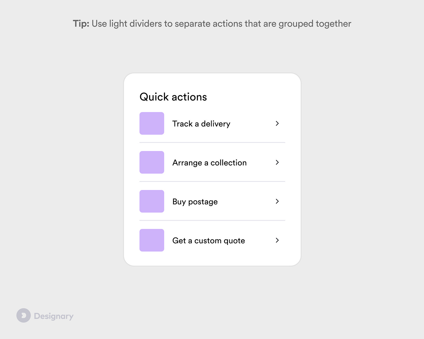
Dividers are an excellent way to add visual hierarchy to your content without drawing a lot of attention, and can work great on both mobile and desktop products:
Use dividers for separating big chunks of content in information-dense pages
Use dividers for calling out important information in smaller spaces, where you don’t want color or a full container
Use dividers for separating list items or actions around the same context
Using color, borders and iconography
Pro tip: Use color, borders and iconography/illustration to draw attention to an element while also separating out the content.
Visual cues such as color or icons can be an excellent way to add structure to your design and layout, while calling out important information or actions that you want your users to take.
A card component with a bold colour and icons or illustration can be a good way to draw the user’s attention to information, or a call to action.
Using scale & type
Pro tip: For cleaner and mobile-first layouts, try using scale and typography to separate out sections.
In modern, clean layouts, it’s often a good idea to use typography and scale to provide separation in your layout. Big, bold headers can often go a long way in making it clear that you are transitioning to a new section.
Here is how to make this work:
Ensure you are using a consistent typography scale throughout your product.
Make sure there is a big different between a section header and a smaller header within the section.
Don’t use too many heading styles in one screen. Try stick to 3 or 4 different styles max.
Summary
Visual hierarchy and structure can be achieved with a number of different UI & UX design techniques
Content blocks, or boxes, are one of the most common ways of adding structure, albeit one of the most prominent ones. Use them sparingly, and only to separate out the key areas of your layout.
Dividers are a great alternative to blocks: they are much more subtle but can go a long way in creating that needed separation between elements in your design.
Visual cues such as color, iconography or borders are an essential tool in calling out important information that you don't want your users to miss.
Typography and scale can also create a sense of hierarchy when used well, without the need for additional visual elements. Structuring content through typography only can be tricky, but is a very common design trend nowadays, used in both mobile & desktop applications.


the concepts were explained in simple language and I liked it! easy to follow