UX Tip #3: Snackbars and Toasts
The when and how to use snackbars and toasts to make your product feel more alive and dynamic
Snackbars (or toasts) can be an easy way to add delight and function to a web or mobile application. They are a failsafe method of establishing a feedback loop with your users, informing them that something has happened, whether positive or negative.
Snackbars can make applications feel more alive and dynamic, but only when used carefully and according to standards.
In today’s tip we will look at how to design them effectively.
What’s the right name?
Both! The terminology became widely popular by Google’s Android & Material Design, and describes two very similar interaction patterns:
Snackbars are messages that may optionally take user input and/or be dismissed by the user.
Toasts are messages that are purely informational and are automatically dismissed.
💡 For the sake of simplicity, we will refer to these elements as snackbars in the rest of the article.
When to use them?
Snackbars are used when you need to alert users without necessarily requiring an action or input, usually for confirmation/acknowledgment or alerts. They are meant to be a subtle notification that draws attention but doesn’t interrupt what they are doing.
For that reason, it’s best to use snackbars for:
Confirming that an action has been successful e.g. updating data.
Alerting that an action couldn’t be completed.
When not to use them?
When displaying crucial information that requires user action. Such information should be displayed in modals or entirely separate pages/views.
For displaying information that is irrelevant to what your user is doing. E.g. an announcement or promotion should never be displayed in a snackbar.
Where to place them?
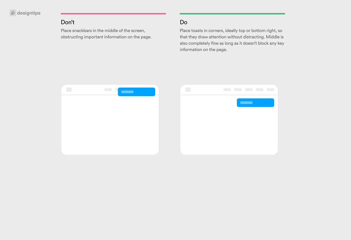
Desktop: Place them at the top right or bottom right corner to avoid distractions.
Mobile: Place them at the top or bottom of the screen, taking up the whole width of the screen.
Avoid overlaps with navigation.
Should I animate them?
Snackbars should often be animated, otherwise they might easily be missed by your users. Once again, try not to distract with animation though: A very subtle fade or slide & fade, spanning no longer than 200-400ms should be more than enough.
Fade-in animation of 200-400ms is roughly consistent with the saccade time for the eye to refocus on a new place onscreen.
A duration of 50ms * No. of characters is roughly consistent with user reading speed. Source
Should it disappear automatically?
In most cases, yes. After all, you wouldn’t want to obstruct your user from what they were doing for too long.
However, make sure you give them enough time to read the snackbar content, especially if it spans more than 1 line of text.
💬 One common formula I use as a reference is each 1 character equals every 100 milliseconds(including spaces). For a short notification that varies between 20 to 30 words, giving 3 seconds as an average reading time is adequate.
From Shan Chen.
Can I show multiple ones?
In specific cases only. Use multiple, stacked snackbars only if it’s absolutely essential, and only on desktop web applications. If your audience consists mostly of power users, performing multiple actions at once and handling multitudes of data, then it’s ok to stack multiple toasts if they need to be informed of different outcomes.
In most consumer facing applications, especially mobile, you should never show more than 1 snackbar at a time as it will be overwhelming to users, and especially hard to read.
Is it accessible?
Absolutely, snackbars are screen-reader friendly: just make sure to refer to your respective development framework specs. For example, in HTML you can use an aria-live region so that the screen reader announces any snackbar content.
I couldn’t be bothered to read the whole article, can you summarise?
Hey, happens to the best of us.
Snackbars are used to inform your user that something has happened after they have taken an action.
Snackbars should draw a bit of attention, but not distract too much from what your user was doing.
They should be positioned at a corner of the screen on desktop (preferably top or bottom right), or at the top/bottom of the screen on mobile.
They shouldn’t ever hide core navigation elements like headers or tab bars.
Their content should be short and concise, allowing for quick scanning.
You can use different variants for positive, neutral or negative messages.
Iconography is fine, but try keep it simple and not overdo it.


