UX Tip #17: Use simple input fields for date of birth
Date pickers and calendars are not always the best option
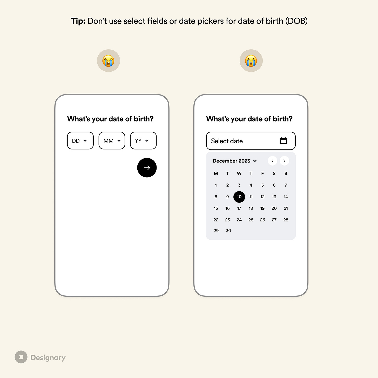
Pro tip: Use number fields when asking for a user’s date of birth.
Date input can be a challenging user experience to get right. There are many different interaction patterns to choose from, and native OS behaviors also vary considerably between date pickers, calendars, and numeric fields.
The issue with select fields and calendars
In most cases, select (dropdown) fields and calendar inputs are suboptimal input methods to use when asking for a user’s date of birth:
They require multiple taps to get to the right date.
They both work well with default options, but in this case, we can’t predict when a user was born.
Even though mobile pickers are considerably better than dropdowns on desktop, they are still slower to fill in than standard text fields.
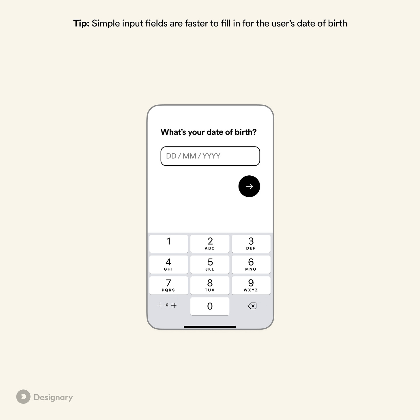
Why simple input fields are better
The simplest and most error-proof method is to use one or more numeric input fields when asking for a user’s date of birth, provided you do some additional validation and use a few smart tips to ensure the experience is intuitive, easy, and errorproof.
Simple input fields are better because:
Users are familiar with writing down their date of birth from filling in paper forms.
It takes a considerably smaller amount of time compared to other input types.
It’s easier to correct a mistake.
Multiple fields are better than one
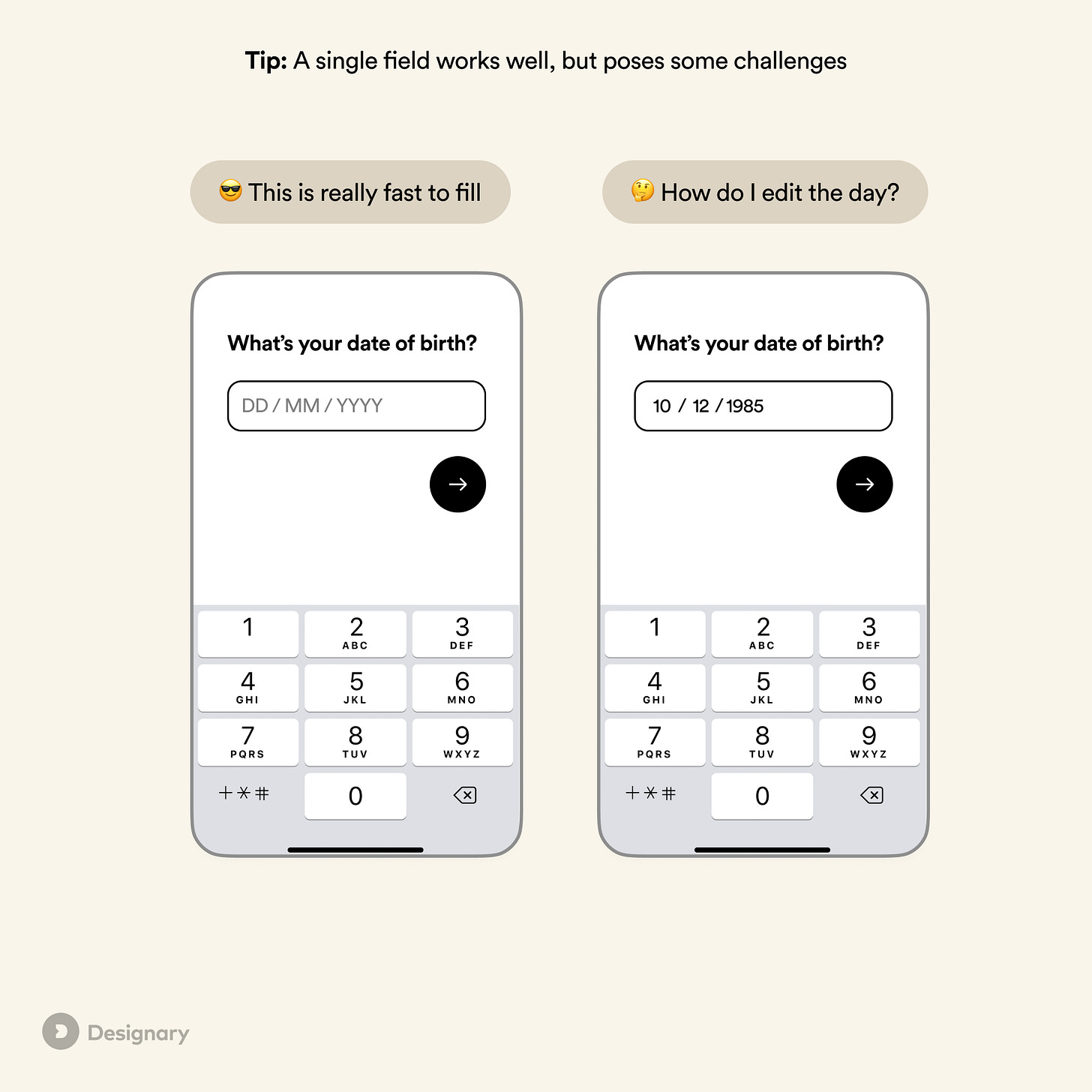
A single field for date of birth still poses some challenges:
Users can’t quickly fix a specific part of the date, e.g., the day or month.
Focusing on one field isn’t possible, which means some accessibility features can’t be leveraged.
There is some ambiguity in the format once the user has filled in the date.
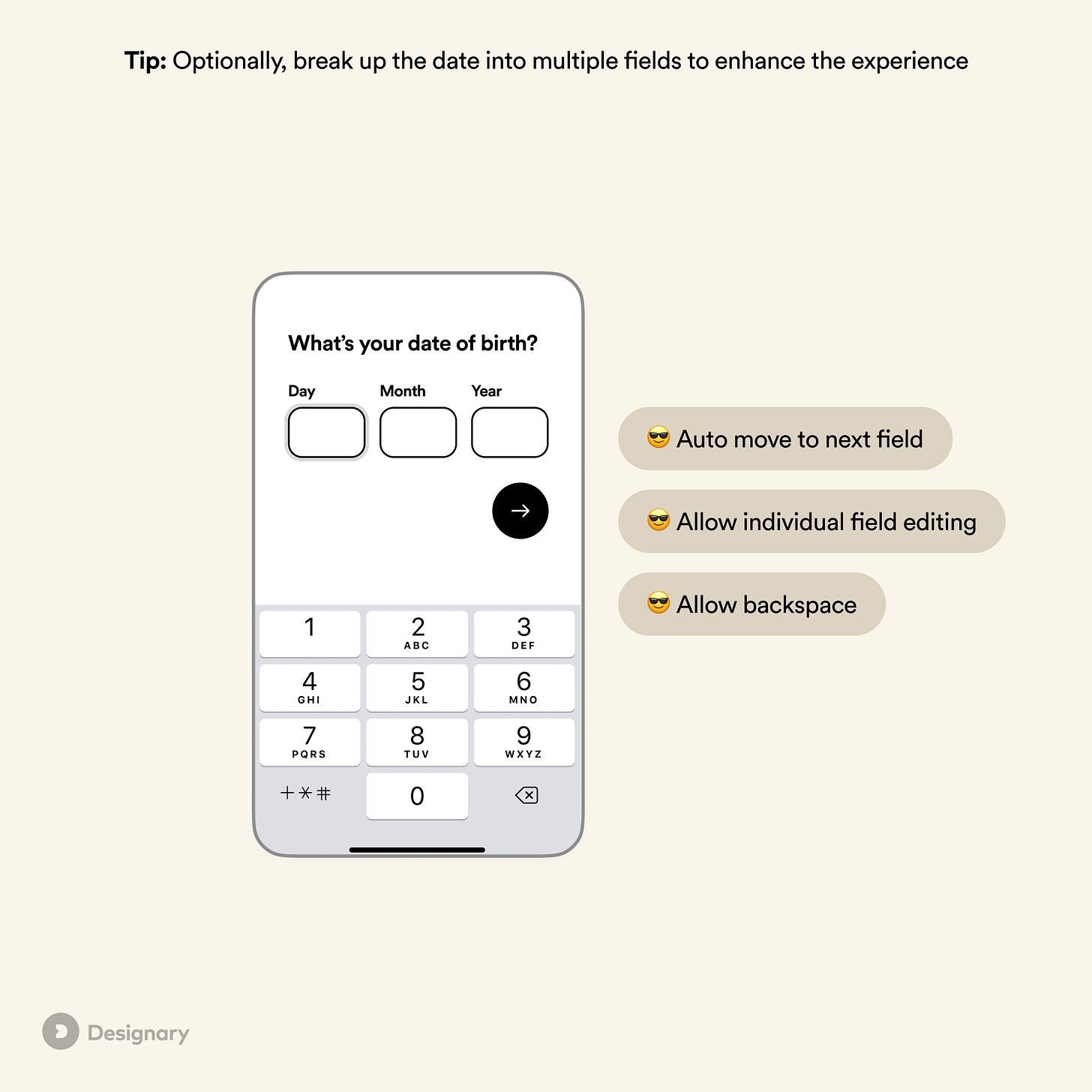
To solve this, you can break up the date input into multiple fields, allowing for independent editing of each value.
As outlined in Smashing Magazine and Adam Silver’s blog, there are a few things we need to get right in order for this to work:
The user should automatically move from one field to another when typing to eliminate the need for an extra tap or key.
Backspace should automatically move them to the previous field.
The user should be able to edit each value independently.
Day or month first
Use day or month first, depending on where most of your audience is located: If you have a US-focused product, use MM/DD/YYYY. Otherwise, use DD/MM/YYYY or whichever format the majority of your audience will be familiar with.
When not to use a number field for dates
If you are asking for a past date that is more likely to be closer to the current date or a date in the future, a date picker or calendar interface is a better choice. Examples include:
Booking flights or accommodation.
Selecting the date range in a reporting tool.
Setting a start date for a service or action.
In such cases, a typical date picker with a calendar interface is often the most intuitive way for a user to fill in the respective date.
In summary
If you are asking for a user’s date of birth in a mobile or web-based product, opt for simple input fields over date/calendar pickers, as long as your team can afford a bit of additional development effort.
Single fields with automatic masking work well, but the most errorproof method is to use a combination of number fields to allow for accessibility features and independent editing of each value.
References
Smashing Magazine - https://www.smashingmagazine.com/2021/05/frustrating-design-patterns-birthday-picker/
Adam Silver - https://adamsilver.io/blog/form-design-multiple-inputs-versus-one-input/


I love how granular and specific this post is. Well said, too!